
Good Ave Design Website Styles
Here you can reference the typography hierarchy, color application, and the use of saved sections that are aligned with your branding. Please also view the video available in the button below on how to use this guide, as well as the built-in Squarespace style features.
Typography Hierarchy
This is Heading 1
This is your largest text. Use this for titles of your pages or sections. The copywriting for these should be 1 - 5 words.
This is Heading 2
This is your second largest text. Use this for any sub-titles of your pages or sections. The copywriting for these should be about the length of a sentance.
This is Heading 3
This is your second sub-heading. Use this for titles for multiple items like lists
This is Heading 4
This is your smallest heading. Use this for sub-titles in groups of items like lists, or longer-form statements that are 1-2 sentences long.
This is Paragraph 1
This is your largest paragraph or body text. Use shorter-form body text.
This is Paragraph 2
Use this for the majority of your longform copy, with 1-3 paragraphs.
This is Paragraph 3
This is your smallest paragraph size, use this for footnotes, or secondary body information.
Color Guide
Below are the suggested section background color schemes when adding new sections to the website. Each section has colors already assigned to the elements such as the texts and buttons. The order of these background section colors reflect the frequency of their use. I.e. Primary Section Background - Light, would be used first, then followed by the descending color schemes, to distinguish between sections which include different information.
Primary Section Background Color Scheme - Light
This is called “Light 1”. This is a primary section background color scheme in light.
Text color should be Noir.
Primary Section Background Color Scheme - Dark
This is called “Bright 2”. This is a primary section background color scheme in dark.
Text color should be Chalk.
Secondary Section Background Color Scheme - Dark
This is called “Dark 1”. This is a secondary section background color scheme in light.
Text color should be Chalk.
Teritiary Section Background Color Scheme - Dark
This is called “Darkest 1”. This is a tertiary section background color scheme in dark.
Text color should be Chalk.
Teritiary Section Background Color Scheme - Light
This is called “Lightest 1”. This is a teritiary section background color scheme in light.
Text color should be Chalk.
Utilizing Saved Sections
Below are a sampling of the saved sections within your website. When you go to add a new section, click on “Saved Sections” on the left-side menu, and you will see sections that are already designed and built that you can add anywhere. Then, you can customize that section with changes to the texts, images, and colors to suit that section’s information.
This is a full-bleed, image section - used on the homepage
About Us
At Good Ave Design, we are reminded every day that life is a journey—one that requires slowing down, reconnecting, and honoring the path we’re on. When creating a home for our clients, we envision a space that embodies the spirit of that journey, offering us a chance to pause, reflect, and create something meaningful.
We believe that design is more than just aesthetic; it’s about stories, about understanding the essence of who someone is and where they’ve been. For us, it’s about knowing that every space we create is as unique as the person who will inhabit it. That’s why we listen. We ask questions. We get to the heart of each individual, knowing that true design reflects their journey and elevates their experience.
We are inspired by the world around us, especially here in Sonoma County, where nature, culture, and history blend seamlessly. The textures, the layers, the stories of this place—these are the building blocks of our designs. Our work is meant to feel homey and grounded, yet cultured and dynamic. We seek out beauty in every detail, but we also embrace imperfection, knowing that it is these imperfections that give each space its character and soul.
Welcome to the journey. Welcome home.


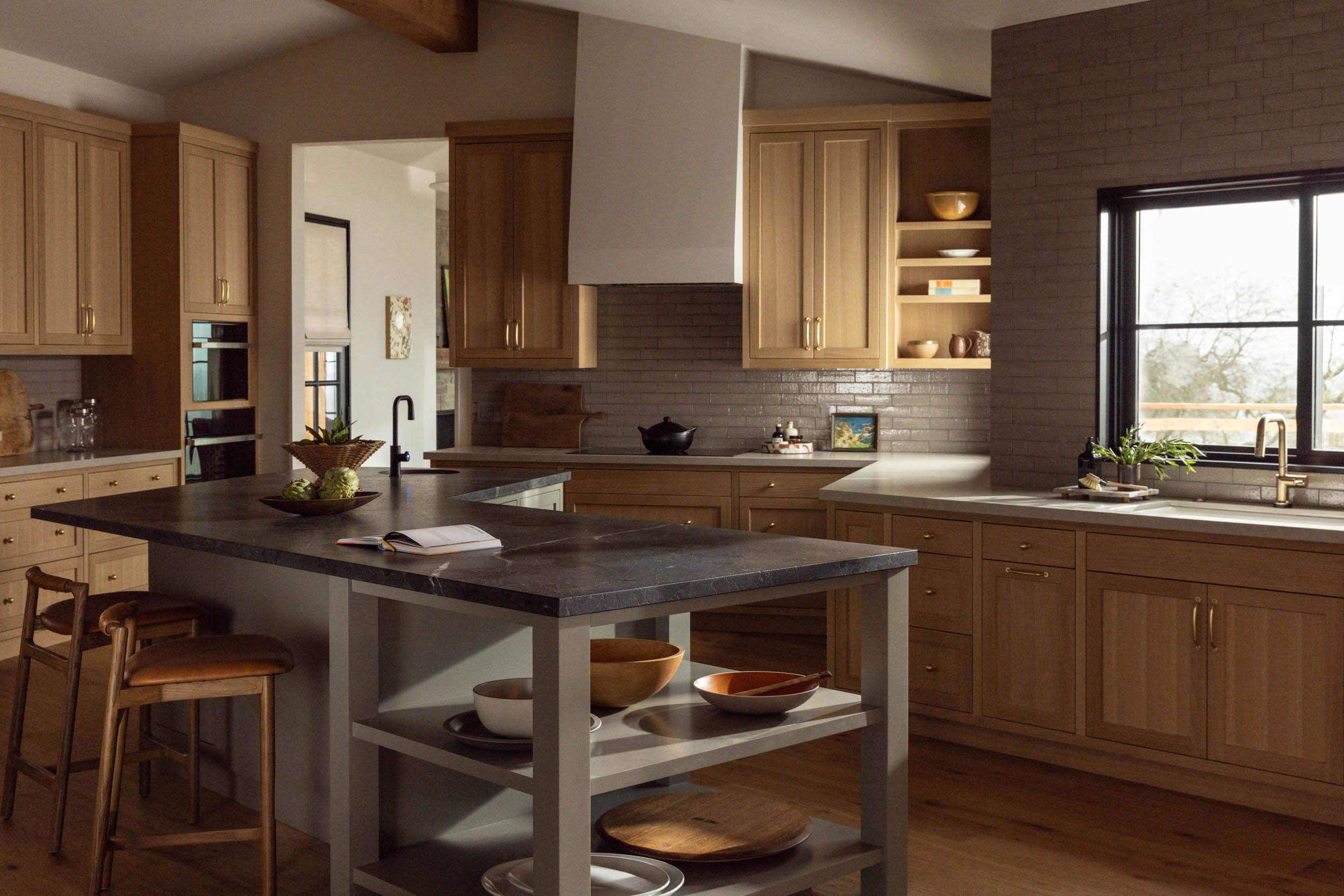
This is a split section with 2 vertical images
Vivamus sagittis lacus vel augue laoreet rutrum faucibus dolor auctor. Nullam id dolor id nibh ultricies vehicula ut id elit. Vivamus sagittis lacus vel augue laoreet rutrum faucibus dolor auctor. Curabitur blandit tempus porttitor. Cum sociis natoque penatibus et magnis dis parturient montes, nascetur ridiculus mus. Vestibulum id ligula porta felis euismod semper.
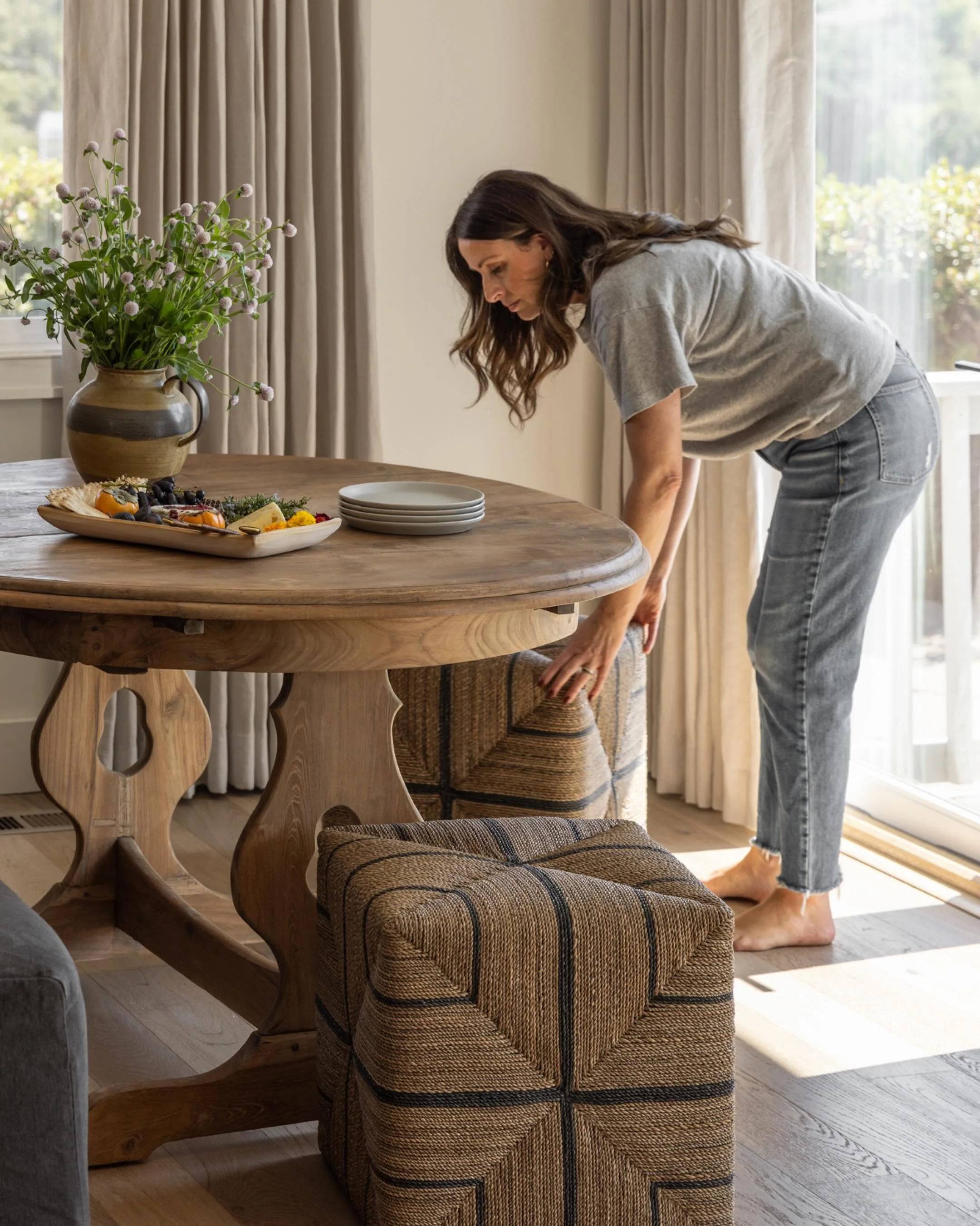
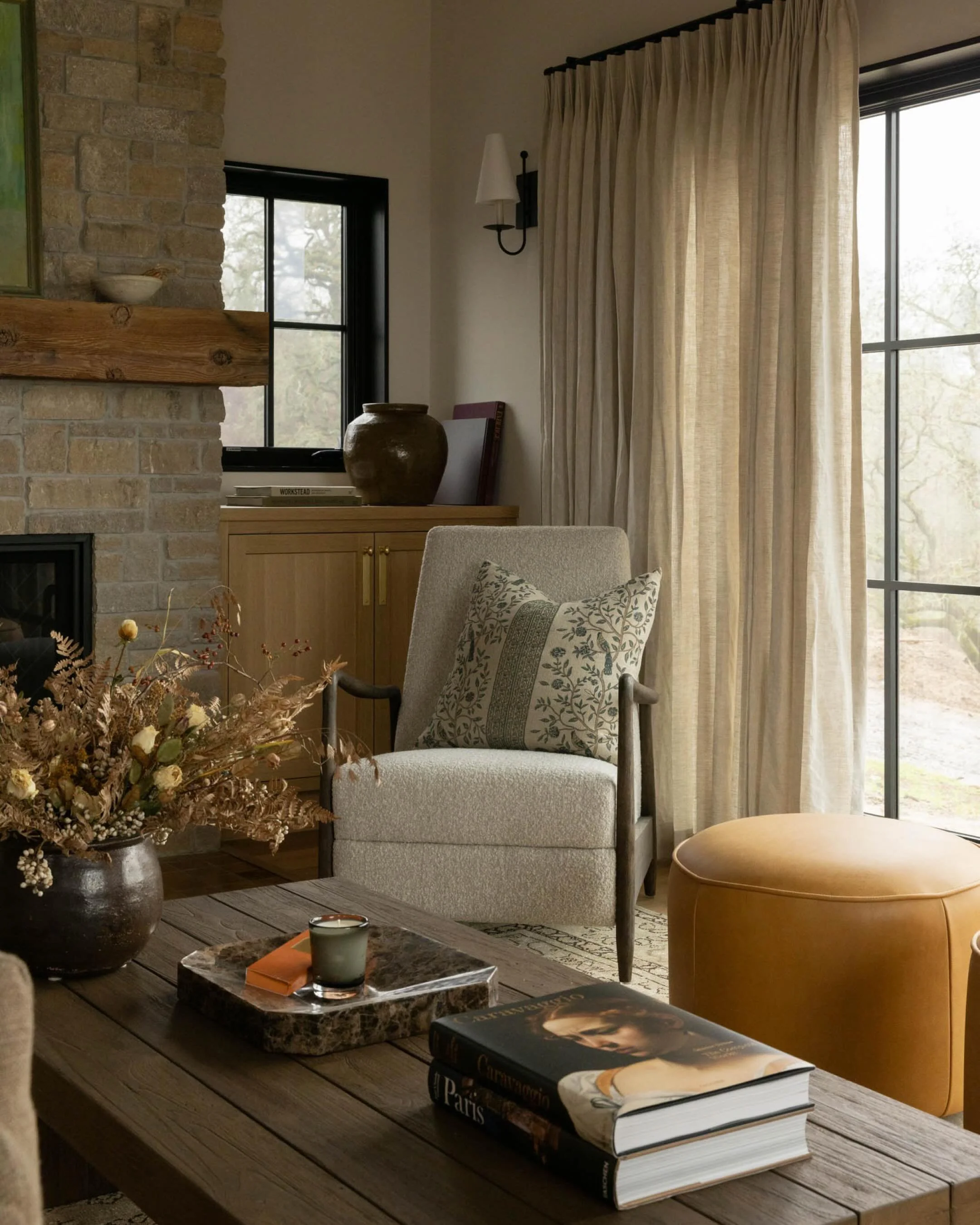
This is a split section with a single, full bleed, square image
Vivamus sagittis lacus vel augue laoreet rutrum faucibus dolor auctor. Nullam id dolor id nibh ultricies vehicula ut id elit. Vivamus sagittis lacus vel augue laoreet rutrum faucibus dolor auctor. Curabitur blandit tempus porttitor. Cum sociis natoque penatibus et magnis dis parturient montes, nascetur ridiculus mus. Vestibulum id ligula porta felis euismod semper.


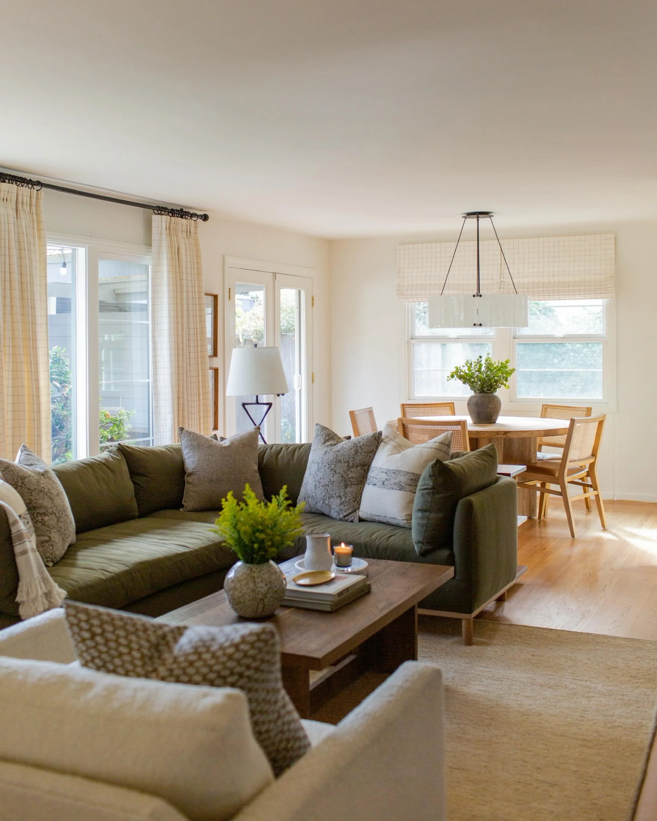
Split section with inset landscape image
You can use this to introduce information, and include a CTA (button) below
This is an Instagram block
You can drop this on any page on your site to display your latest instagram posts

A Statement-making, text-only heading section with CTA
Another statement-making section
But with room to expand on more information!